Hotel Quote.
Redesign of a B2B Product.
What is it? Hotel Quote enables hotel reservation managers to generate branded quotes in response to direct booking requests automatically.
Product Overview
Product Goal
Helps hotel booking managers, create automated and branded quotes in seconds, up to more than 90% faster, compared to existing methods.
Target Audience
Hoteliers or hotel managers, which is the entry market.
Hotel guests, receiving the templated quote, serve as the audience.
Context of Use
Customer emails typically received and managed during (hotel) working hours, mostly on desktop devices.
User Needs | User Pain Points
Efficiency in Task Management
Brand Consistency
Maintain Personalization
A Hotel Quote responseManual way of respondingDesign Brief
This project highlights the evolution of a backend-driven product from MVP to a more refined version. After validating the concept, the focus moved to market expansion and improving user experience. Initially, many features were added based on client feedback, without fully reassessing the user flow and experience.
Background:
Redesign the existing Web App interface with a primary focus on Interaction Design and Information Architecture.
Design additional features and components that were not prioritized during the MVP stage.
Propose a KPI strategy to analyze future user satisfaction with the product.
Scope of Work:
The founder/engineer who also assigned me the task.
As a team of 2, there is close collaboration and a synergy in conversations that usually expand beyond the typical role of a UX Designer with an engineer or a client.Myself, as a product designer.
Team/My role
The project is utilising Material Design - based UI libraries that aim at speed of development given the product-market phase of the company. Hence this is a design limitation I had to work with.
Constraints:
6 Weeks - ongoing (focusing on different features).
Timeline:
I. Design Analysis
User Research Findings
Objectives from user interviews:
understand user satisfaction
pinpoint usability issues
identify potential new features
Method used:
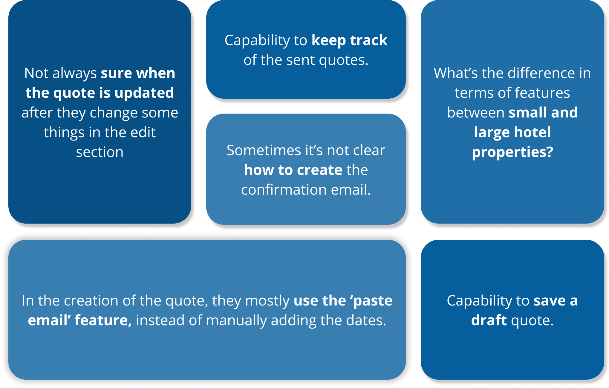
As the founder wanted to maintain close client relationships, I created key questions for the founder to use in interviews.
Participants:
4 out of 9 clients agreed to have a call with the founder, answer our questions, and provide further feedback on the product they've been using for six months.
Redesign Approach
I identified three key product elements that warranted improvement: the web application, the generated quote template, and the landing page. However, we chose to prioritize the user experience of the quote creation in the web app.
This touchpoint is the backbone of the whole product, and the success of the entire user experience and customer satisfaction depends on its usability and utility.
Web ApplicationQuote Template* This is the old design version.* If interested, you can also find here the Landing page.
Key Redesign Strategy
Structuring the information | Navigation Diagram
Οrganize the main categories and actions. This helps:
Users to find, remember, and complete tasks faster
Removes hard-to-find components (like the confirmation email button)
Simplifies future category and feature additions.
Use of Side bar | User Flow Diagram of Quote Creation.
The Sidebar will continue to serve as the primary working area of the web app, as it contains the app's core functions. For this project, the top priority will be redesigning and improving the user experience (UX) of the Sidebar, with a particular focus on redefining and enhancing the Quote creation feature (as shown in the diagram).
II. Design Proposition
Side Bar | Step 1- Search and Generate Quote
Design Analysis and Implementation
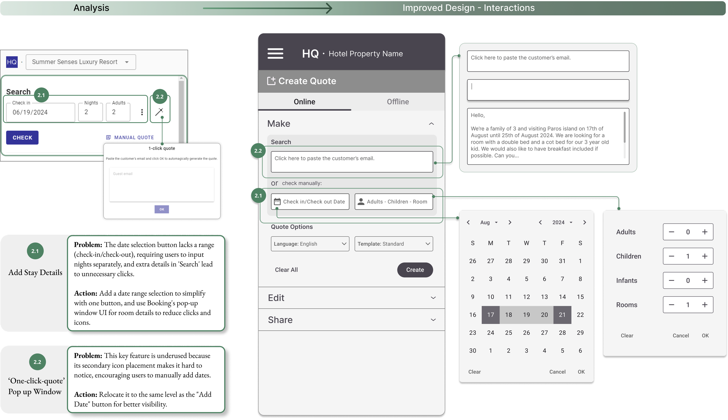
Understanding and analyzing in depth the current design really shaped and justified the decisions and direction I had to follow as a next step.
Design Options | Process
Exploring different design alternatives during the wireframe phase helped justify my decisions and effectively incorporate early user insights. However, this remains an ongoing process.
Low Fidelity Prototype| User Flow 1
The user pastes the received email in the text box.
The user selects themself the requested dates and room details.
Low Fidelity Prototype| User Flow 2
Before
After
Side Bar | Step 2 and 3 - Edit and Share Quote
Design Analysis and Implementation
The Edit action involves key inputs and multiple user paths that need to be clear and simple. Though functional, the current design's flow, layout, and interface need improvement.
Edit Windows Interaction Flow and State Management
This interaction flow focuses on the 'Edit' pop-up windows, incorporating user feedback from the design analysis. It also adds visual cues in the Edit icons, clearly showing when changes have been made and updated in the quote template.
Low Fidelity Prototype| User Flow 2
Mockup Exploration
Note 1:
Given that this is a B2B product already utilizing the Material Design Library, with no plans for change, there is no current need to design detailed mockups. A simple rough suggestion, as depicted below, is sufficient.
Note 2:
Since mockup designs were not part of the project's scope at this stage, I decided to deliver more structured and well-defined wireframes.
Selected Design
III. Adaptation and Evaluation
Setting Initial Key Performance Indicators
Time Reduction: Measure the average time taken to respond to guest inquiries before and after implementing the redesign. A significant reduction would indicate that the tool enhances productivity.
Error Rate: Monitor the error rates in the automated text box to ensure the system is functioning correctly and not forcing users to enter information manually.
Conversion Rate: Monitor how many guest inquiries handled by the system converted into confirmation quotes - therefore- bookings. This will serve as additional business validation, supporting further promotion of the product.
Quotes created over time: Track quote generation in monthly and quarterly intervals to account for seasonality and monitor pricing and packaging effectiveness.
Reflecting on the project.
Real project.
Working on a real project and collaborating closely with the founder and engineer was a great experience. I managed multiple parameters for component implementation, prioritized tasks for different stages, designed tables with heavy user actions, and learned new terms about components and the technology driving them, such as component state management and user interactions.
Process is key.
I knew that from architecture too, but I had my mentor to remind me of keeping track of my wireframe designs and how they evolve or what where the options I had to deal with before coming up with the design I felt more comfortable calling it as ‘final’.
Don’t try to solve all at once.
This project, while specific, contains many edge cases, making it initially difficult to determine where to focus and plan my workload. After some initial wireframe sketches, I decided to concentrate first on one screen and service of the side tab. Once I solidified some components and structured the information hierarchy, I then moved on to the next screens and tables.
It’s not all about hi-fi.
On my first steps of the UX path, I believed high-fidelity (hi-fi) designs were crucial for demonstrating a project's potential. However, after working on a project focused on restructuring user flow, cognitive load, and information architecture, my perspective changed. Hi-fi designs are important, but structuring information and user flow is equally vital. For B2B products or certain priorities, hi-fi designs might even be appropriate in later product lifecycle stages. This realization led me to forego hi-fi designs in this project.


